Candidate Experience: turning a passive wait into an active process
Client
Taledo
My role
UX Designer
Year
2018 – 2022
Type
B2B2C · Multi-sided platform
My role
I owned the candidate experience end-to-end across the Taledo platform. This included defining the information architecture, designing all candidate-facing flows from signup through offer acceptance, and building and maintaining the design system used across the product. I worked across all three sides of the platform (candidates, companies, and internal recruiters) but the candidate experience was my primary ownership.
The initiative to make the candidate experience more active came from me. After talking directly with candidates and experiencing the product myself, I identified the passivity as a structural problem, presented it to the VP of Product, got it approved, and led the design of the solution. Login frequency went from roughly once a month to multiple times per week after these changes shipped.
The problem
Candidates signed up, then had nothing to do
Taledo was built around a curated model. Candidates didn’t apply to jobs: they created a profile, were vetted by an internal recruiter, and if accepted, were matched with companies who would reach out directly. It was a fundamentally different recruiting experience, and for the right candidate it worked well.
But the model had a side effect that only became visible over time. Once a candidate completed their profile and submitted it, there was nothing left for them to do. They waited. If a match appeared, they would hear from a recruiter. If not, they heard nothing.
Many candidates went weeks or months without logging in because they understood, correctly, that there was no reason to. The platform had become something they signed up for and forgot about. This was bad for candidates, and it was bad for the platform: disengaged candidates were harder to match, less responsive when opportunities arose, and less likely to keep their profiles current.
- · No actions available to candidates after profile submission
- · Long gaps between logins as candidates saw no reason to return
- · Profiles became stale without regular prompts to update them
The insight
Passivity was a design problem, not a model problem
The curation model itself was not the issue. Candidates understood and accepted that they were not applying to jobs directly. What they couldn’t tolerate was the feeling of having no presence in their own process.
Candidates didn’t need control over the outcome. They needed something to do while they waited for it.
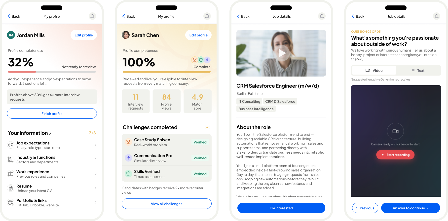
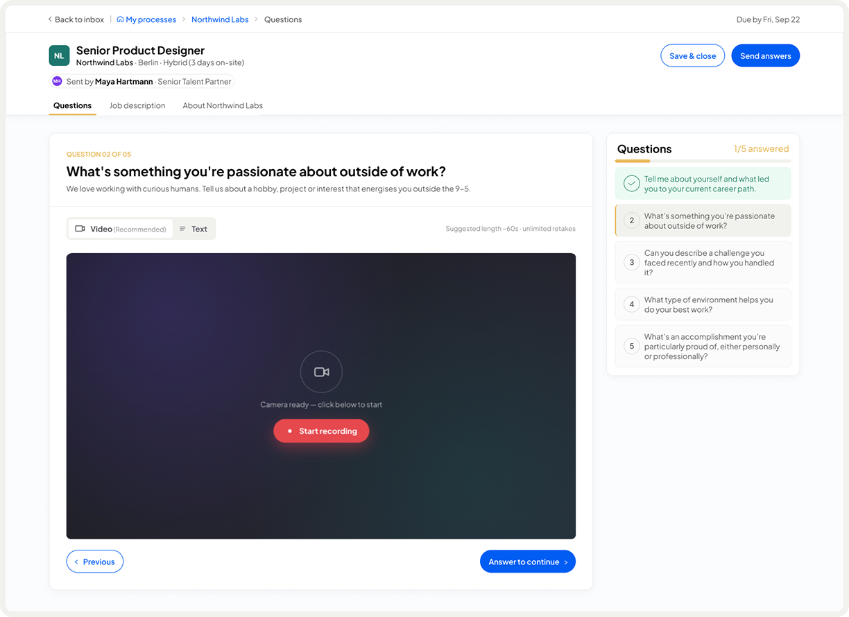
The solution wasn’t to change the recruiting model but to give candidates meaningful ways to engage with the platform between the moments that actually mattered. Browsing job ads, marking interest in companies, answering prompted questions, tracking their active processes: none of these gave candidates direct control over hiring decisions, but all of them gave the experience a sense of forward motion.
This also had a practical benefit for recruiters. A candidate who had marked interest in a company provided useful signal. A candidate who had answered video questions gave recruiters more to work with. Engagement on the candidate side made the recruiter’s job easier without changing how the curation model worked.
The journey
Designing for every state a candidate could be in
Because the candidate experience was non-linear and largely dependent on external decisions, every state had to be deliberately designed. An empty state for a candidate waiting to be vetted is a very different problem from one who has three active processes running in parallel.
01
Profile submitted, awaiting vetting
The candidate has submitted their profile and is waiting for an internal recruiter to review it. The platform communicated clearly what was happening and what to expect, so this didn’t feel like a black hole. Candidates could explore job ads and mark industry interests while they waited.
02
Not accepted into the database
Some candidates had profiles that didn’t match anything Taledo could offer. This was a sensitive moment requiring careful design. The message was explicit that the issue was a gap in available positions, not a judgement on the candidate. They could update their profile and resubmit, or request full data deletion.
03
Accepted, no active processes yet
The candidate is in the database, assigned to an internal recruiter, and has had their onboarding call. No company has expressed interest yet. This was where disengagement was most likely. Candidates here were encouraged to browse job ads, signal interest in companies, and answer questions to improve their visibility.
04
Active process with companies
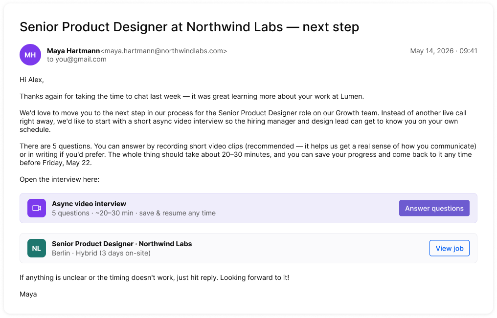
A company has shown interest and a process has started. The candidate now had a dedicated view showing each active process, a calendar of upcoming interviews, and all communication threaded by company. The internal recruiter would also prepare them for each interview.
05
Interview scheduled
Interviews were scheduled through the platform. The candidate selected a time slot from options provided by the recruiter. Once confirmed, both parties had a private space within the event to add notes or things they wanted to remember during the call. Neither side could see what the other had written.
06
Process concluded
Whether a process ended in an offer, a rejection, or a withdrawal, the outcome was recorded and visible in the candidate’s process history. This gave the full journey a sense of completeness rather than leaving processes open and ambiguous.
Key design decisions
Four decisions that shaped the candidate experience
01
From chat to email threading
Communication between candidates and companies was initially designed as a chat interface, with messages in the left and right bubble format familiar from messaging apps. After seeing real messages in use it became clear that the tone and length of recruiting communication was closer to email than chat. The UI was redesigned to reflect that, fitting better with how people actually wrote in this context while still keeping all threads accessible inside the platform.
02
Interest signals, not applications
Candidates could browse job ads and mark interest in a company or role. This was not an application: it was a signal to the internal recruiter that this candidate wanted to be considered for this opportunity. The distinction mattered both in the model and in the language used throughout the UI, to avoid creating the impression that marking interest would directly trigger anything.
03
Private preparation space in interviews
Both candidates and interviewers could add private notes to a scheduled interview event before it happened. Neither side could see the other’s notes. For candidates this served as a personal checklist. For recruiters it supported a consistent interview structure without requiring them to rely on memory or external documents. The privacy boundary was a deliberate design choice to make both sides feel comfortable using it honestly.
04
Rejection designed with honesty and respect
When a candidate’s profile didn’t match what Taledo could offer, the rejection experience was designed to be clear about the reason without being discouraging. The framing was always about the platform’s limitations, not the candidate’s suitability. Candidates could choose to update their profile and resubmit, or request complete data deletion. Both paths were equally visible and equally easy to take.
Outcomes
Candidates who had a reason to return, returned
The shift from a passive to an active candidate experience produced a measurable change in engagement. Making the platform somewhere candidates could do something, rather than somewhere they had already done everything, changed how they related to it entirely.
The design system built across the project also ensured that as the platform grew and features were added, the experience remained consistent across all three user types without requiring design work to restart from scratch each time.
Weekly
Average login frequency after the active experience shipped, up from roughly once a month
3 sides
User types designed for within a single coherent system: candidates, companies, and internal recruiters
End to end
Full hiring journey supported in one platform, from first contact to offer, without relying on external tools