Transit Navigation App: designing end-to-end, from bus stop to interface
Context
Academic project · UFES
My role
UX Research, UI Design
Year
2012 – 2013
Platform
Android · Mobile
My role
Where my end-to-end process began
This was an academic project completed during my design degree at UFES, not a commercial engagement. It's included here because it's the earliest example of a full end-to-end UX process in my work. I led the UX and UI design from initial research through final interface: defining the research approach, building the information architecture, designing and testing prototypes at increasing fidelity, and delivering final designs to support implementation.
The problem
Getting around by bus meant guessing
Public transportation systems can be difficult to navigate, especially for people unfamiliar with routes, stops, or schedules. At the time, the information needed to plan a trip was scattered and often unclear, forcing riders to piece it together from multiple sources.
In practice, this meant people struggled to understand which routes connected two points, where the nearest stop actually was, and when the next bus would realistically arrive.
The goal was a mobile experience that let people orient themselves, plan a route, and make decisions in real time, rather than guessing and hoping.
- · Unclear which routes connected a given departure and destination
- · No reliable way to locate the nearest relevant stop
- · Arrival times were difficult to estimate with any confidence
- · Trip information lived across disconnected, inconsistent sources
- · No support for the routes people actually used every day
The approach
Starting at the bus stop, not the sketchbook
The process began with field interviews with riders directly at bus stops, to understand their objectives, priorities, and pain points before any design work started. Those conversations were synthesised into ideas and validated through card sorting, which shaped the first information architecture of the app.
From that architecture, I built low-fidelity wireframes and tested them with prospective users, refining the structure and flow based on what didn't work. Once the interaction model held up, I developed the high-fidelity UI for a final round of on-site testing, then delivered the final designs into production.
The process
Four steps, repeated with discipline
01
Field research
Interviewed riders at bus stops to surface real pain points and priorities, rather than starting from assumptions about what a transit app should include.
02
Card sorting & IA
Turned research findings into concepts, validated the structure through card sorting, and used the results to define the app's information architecture.
03
Low-fidelity prototyping
Built paper and low-fidelity wireframes from the IA and tested them with prospective users, refining the flow based on where people got stuck.
04
High-fidelity UI & handoff
Developed the final interface for on-site testing, then delivered production-ready designs and supported implementation.
The flow
From two points to a route, in a few taps
-
01
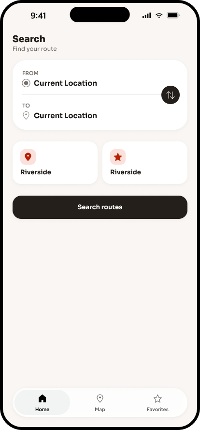
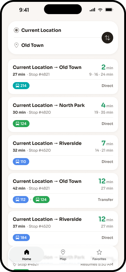
Enter departure and destination
The rider opens the app to plan a trip and enters a departure point and destination.
-
02
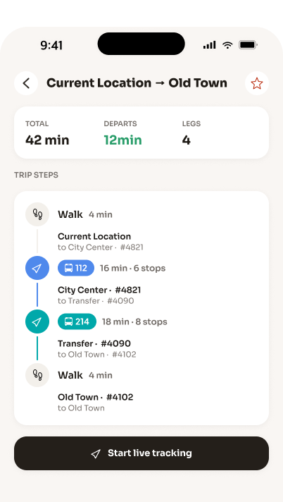
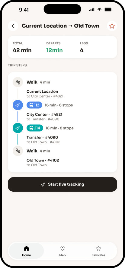
Review route options
The app presents available routes, including any required connections and estimated travel time.
-
03
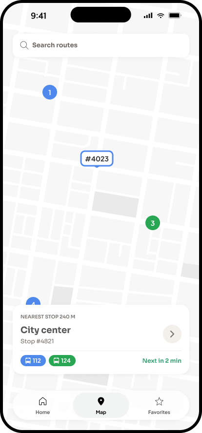
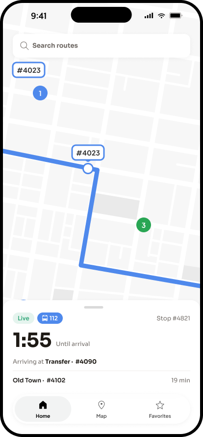
Locate stops and track arrival
Once a route is selected, the rider can see nearby stops and when the next bus is expected to arrive.
-
04
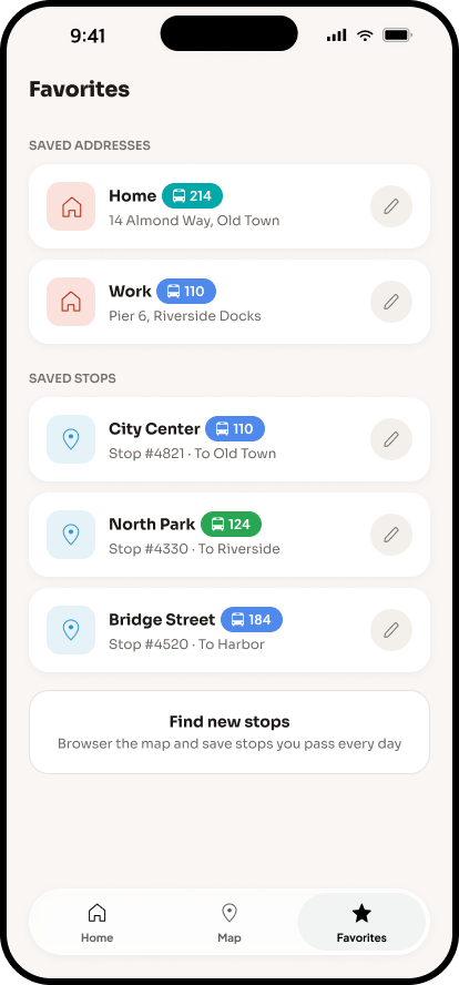
Save for next time
Frequently used routes can be saved, cutting a repeat trip down to a couple of taps instead of a fresh search.
What this project adds
Where this process still shows up in my work today
This was the first time I owned a project from raw field research through to a delivered interface, on my own. Unlike most of my later B2B SaaS work, it was consumer-facing and mobile-only, designed for people making quick decisions on the move rather than professionals working through a desktop workflow.
The discipline of letting research define the structure, rather than retrofitting it, has stayed consistent across every project since.
End to end
First project owned solo from field research through to delivered, tested interface
2 rounds
Of usability testing, at low and high fidelity, with real prospective riders
Mobile
Consumer-facing, mobile-only platform, distinct from later B2B SaaS work